You’ve got the copy and the offer. Now you need one visual to go with them.
An announcement graphic. A one-pager for the deck. Maybe a product shot for the landing page.
And you’re stuck again. You can wait three days for a designer who’s already buried, or fight Canva templates and ship something that looks random.
6 months ago you tried asking AI, after seeing everyone on Linkedin talk about Nano Banana Pro.
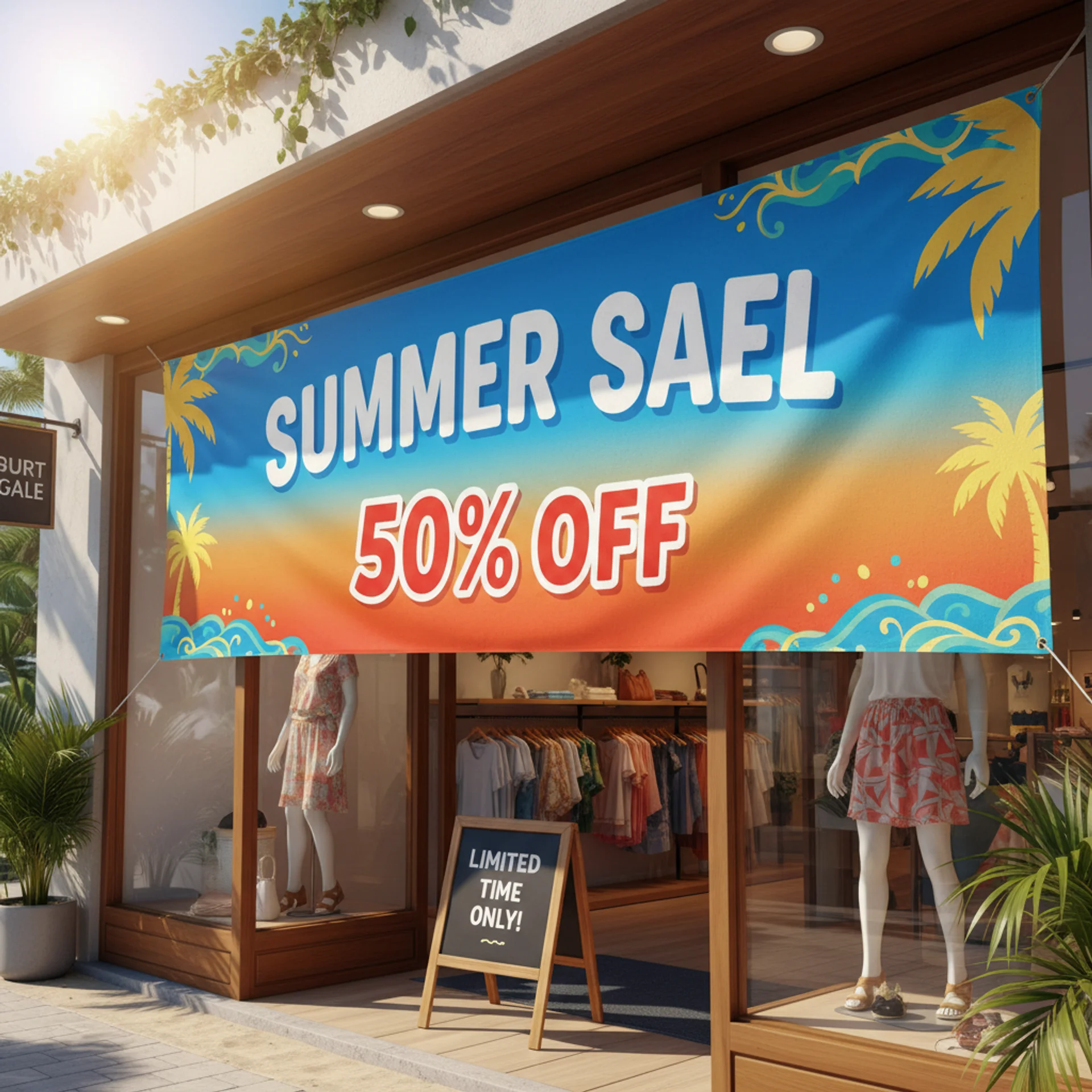
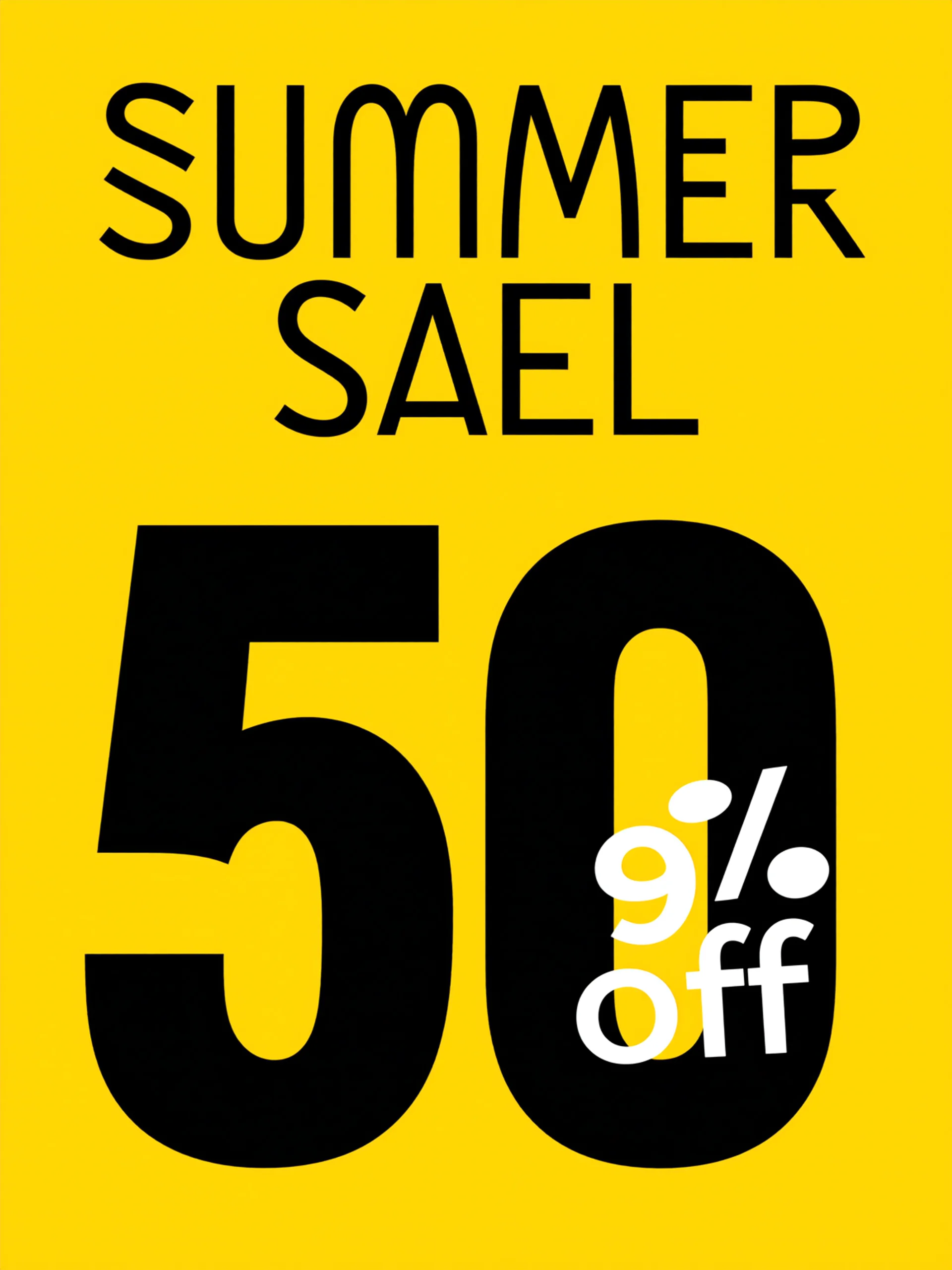
You got back a beautiful banner reading “SUMMR SAEL 50% OF;”. Letters melted into each other. 1 the logo looked like alphabet soup.
Fine for a moodboard. Useless for work. So you went back to the design queue.
TL;DR
→ Three rules that do more than any prompt you’ll copy off a thread
→ Free: that botched banner, fixed live, plus the full infographic prompt
→ Paid: the Brand Lock, and four systems for when three colleagues all start making graphics.
Spelling killed the category
I usually write about behaviour here. This earns an exception.
On April 22, OpenAI released an image model in ChatGPT as Images 2.0.
It fixed what kept image models useless for marketing.
It could spell.
Put a headline, a price, and a promo code on one graphic. All three come back as actual words, at three sizes, sitting where you asked.
It’s also the first OpenAI image model that reasons before it draws (breakdown here). Thinking mode, available on Plus and up, plans the layout the way a creative director would and checks its own work before handing anything back.
Two more releases matter here. This summer, it added a transparent background option, walked through here, which may be the most useful change for marketing work. More on that below.
On August 25, OpenAI added stickers: nine per sheet, arranged in a 3x3 grid, cut out clean, free on mobile, and ready to drop into WhatsApp.
A usable visual now takes four minutes and costs nothing, right in your favorite AI Assistant. The work left is deciding what to make, then helping the rest of your team make it the same way.
Side note: I just published my first book! 😱
After 3 years working intensely with AI and helping companies with their AI Adoption, I wrote down all the key concepts and frameworks I built over time, and the hands-on tactics I use with teams to make sure they use AI for real day-to-day work.
It’s available on Amazon. I hope you’ll find it useful.
“I tried making my own visuals. It looked off. I gave up.”
That’s the line I hear most from non-designers. I’ve trained 1,500+ professionals this past year with We Call Shotgun!, and marketing teams say it almost word for word.
They were right to give up. The tools weren’t ready.
I use this example from a B2B procurement marketing lead. She was convinced AI “doesn’t get her brand.” Her prompt: Write a LinkedIn post about our new feature. Back came 200 words, three emojis, and an “Are you ready to transform your workflow?” hook. Confident, polished, useless.
Then we rewrote the brief with an audience, voice, bans, structure, and a tone reference. She published what came back. Same model, same five minutes.
The first prompt named an output. The rewrite described the job.
Why don’t you give image prompts the same treatment?
Three rules, before any template
1. Quote it or lose it.
Text inside double quotes is treated as an order and rendered character for character. “OPEN LATE” comes back as OPEN LATE. Unquoted, open late comes back as anything. This one habit kills the misspelled headline.
2. Every element gets an address.
“Headline at the top” is vague. “Headline fills the top 70% of the frame, three stacked lines, tight line spacing” is an address. The model follows spatial instructions now, but only the ones you give it. Skip them and everything piles into the middle.
3. Name the junk you don’t want.
The model fills silence with cliches: glowing lightbulbs, handshakes, watermarks, stray text. Close every prompt with a short blacklist.
The skeleton is simple: what it is, where things go, how it’s lit, the style, the exact text in quotes, and what’s banned.
Let’s fix that SUMMR SAEL banner
Telling you it’s better now is worthless without showing you. Start with the lazy version, the way the threads teach it:
Create a sale banner for our summer sale, 50% off. Make it professional and eye-catching, ultra-realistic, 8k, cinematic.
A year ago that gave you SUMMR SAEL. Today it spells fine and still fails, quietly. I ran it twice back to back. Two layouts, two colour schemes, neither of them mine.
Both were acceptable. Neither was predictable enough to build on or hand to a colleague. “Professional” means nothing to a model. It averages every sale banner it ever saw, and averages drift.
Now give the same banner a proper brief:
Create a bold 1:1 sale banner. The words “50% OFF” in massive condensed black serif typography filling 70% of the frame, stacked with tight line spacing. Background: saturated cherry red with a subtle paper grain texture. Top right corner: a small cream starburst graphic, inside it render exactly: “TODAY ONLY”. At the bottom, a thin cream rule and one small line of clean sans-serif, render exactly: “Use code SAVE50 at checkout”. Style: retro department store advertising, updated. No extra text, no watermarks, no stock photos.
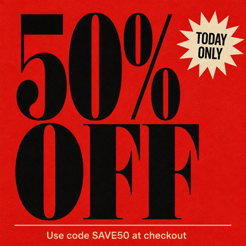
Three text elements sit at three scales: a headline eating the frame, a mid-size starburst, and a promo code small enough. All legible. All spelled right.
The result has typographic hierarchy. No image model held it a year ago, and Canva only hands it to you if you already know design.
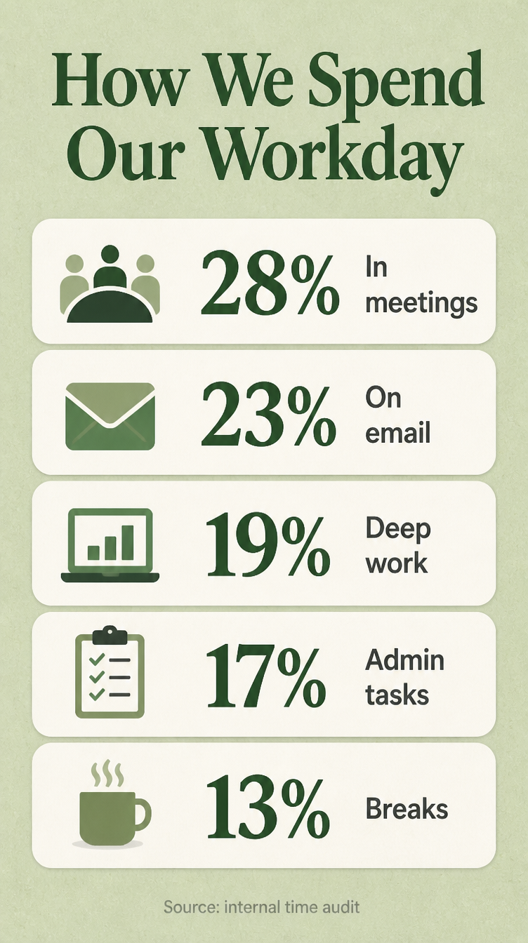
The infographic prompt, whole
I’m giving this one away whole because stat blocks broke first. Labels came back as gibberish. Numbers drifted away from their icons. The current model can hold five data blocks, five icons, a header, and a footer in one layout.
This used to take an afternoon in Canva.
Create a single-page 9:16 infographic titled exactly: “How We Spend Our Workday”. Five horizontal stat blocks stacked vertically. Each block has a small flat-design icon on the left, a large bold percentage in the centre, and a short two-word label on the right. The five stats, render exactly: “28% In meetings”, “23% On email”, “19% Deep work”, “17% Admin tasks”, “13% Breaks”. Background: soft sage green, white stat blocks, subtle paper texture. Header in dark forest green. Footer at the bottom in small light grey, render exactly: “[your source]”. Editorial infographic style, flat and clean. No extra text, no watermarks.
What broke
In a session last year, on a different task, the model handed my client this: “According to Gartner’s 2024 Future of Work report, 73 percent of knowledge workers say AI has changed how they evaluate junior performance.”
Right shape. Round, but not too round. Drop it in a deck and nobody questions it. The report doesn’t exist.
The image model does the same with digits.
It’ll put “47%” beside a label that reads 74%. It pattern-matches shapes.
I now keep the source document open in a split screen and check digit by digit. Two minutes per infographic. Worth it.
How to maintain consistency
You now have two working prompts of your own: a banner with real hierarchy and a full infographic.
Then two colleagues start making graphics too. Within a week, your feed looks like three companies had a go at it.
Those rules can’t hold the same face across ten ads or make fifty assets read as one company.
You need to start with a block of text pasted above every image prompt. It holds the colours, wordmark, typography feel, tone, permanent ban list, and default composition.
Fill it in once and everything after it inherits your look.
I call it the Brand Lock.
🔓 Behind the wall: the Brand Lock in full, and the four systems built on it.
- The Brand Lock, filled in, plus the one line that stops your teal drifting purple across ten graphics
- The Character Block, one recurring face across every ad, and why the outfit matters more than the face
- The Slide System, carousels where six slides read as one document
- The Campaign Multiplier, eight consistent ad variations in one run, the before/after split, and the cutout route that stops your product morphing between frames
- The Form-Fill Template, so your least AI-comfortable colleague can ship on-brand
System 1: the Brand Lock
Run five prompts and you’ll get five styles back. That’s manageable for one person making one graphic. Across a team, it becomes a lot of cleanup work.
That’s why you need a brand lock block in your prompts to maintain consistency and brand voice.
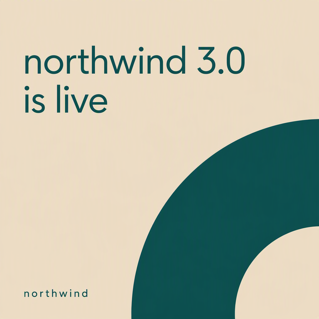
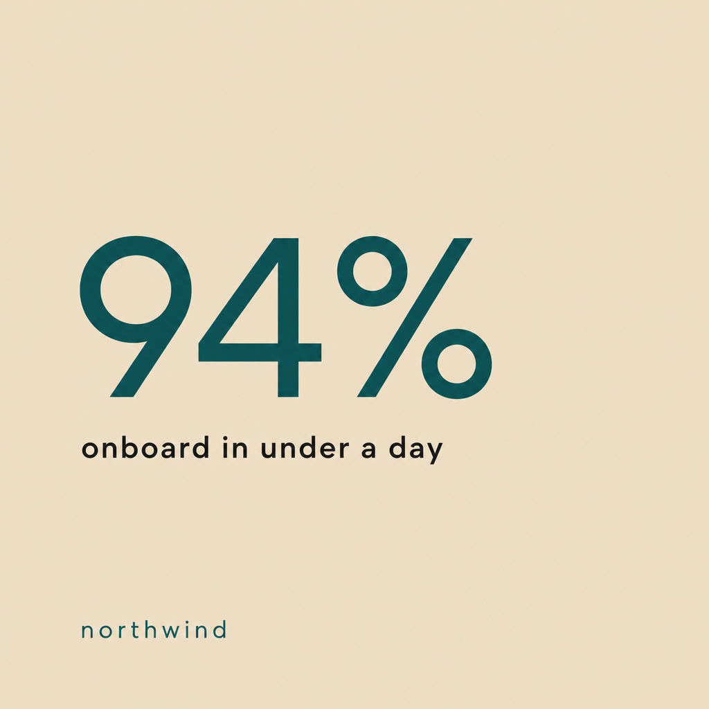
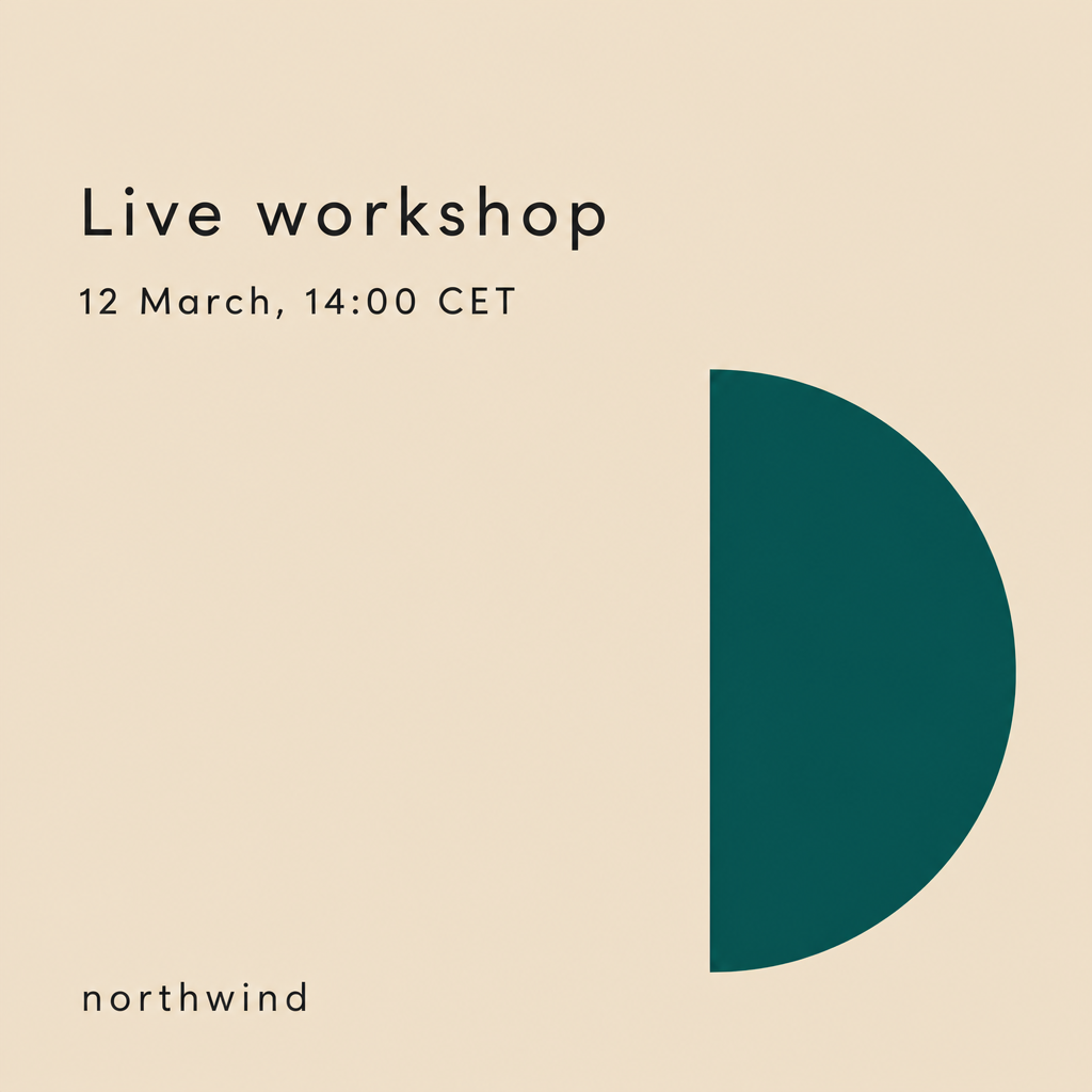
Here is an example of brand consistency with the Brand Lock.Below the prompt I used to generate it.
The Brand Lock block
Want to go deeper? At We Call Shotgun, we help startups and scale-ups integrate AI into their product and GTM processes. Explore our AI adoption programs for hands-on workshops and deployment support.